FLOCARK
A Different Way to Look at War
My YouTube channel recently hit 1,000 subscribers, thanks to some great promotion for the most recent episode by many good internet frens. I started the channel with an eclectic focus, but I eventually focused it on military operations (https://www.youtube.com/@militaryoperations).
In this post I will explain how the video series came about, how my mapping graphics have evolved and provide a link to a high res FLOCARK (Features, Lanes, Objectives, Avenues of Approach, Canalizing Terrain, Key Terrain) map of the Ukraine.
For those of you just interested in the Ukraine map, here’s the link.
The Story of the Ukraine Video Series
Easily 98% of my views came from my series on understanding the Ukraine war from an operational perspective. The series began in when I was frustrated at the low quality of most of the Ukraine war reporting.
In response I created a FLOCARK map of the Ukraine, which is a technique I learned at Command and General Staff College for visualizing terrain from the higher tactical to operational level (Battalion to Army Group or 600-400,000 soldiers). For an explanation of FLOCARK see the linked chapter from episode 4 of my video serise:
I initially wanted to just post the map along with an explanation of my deductions, buy I realized none of my deductions made sense without a fair bit of background information:
By the time that I completed the background information I had gone through four episodes totalling an hour and eighteen minutes of content.
Evolution of the Mapping Graphics
The twitter post above used the same technique for FLOCARK as I was taught in staff college. Specifically:
Paste a high res copy of the map into PowerPoint;
Add shapes by hand over the various terrain features; and
Delete the map.
This is how I created images like this one:
As you can imagine this is incredibly time consuming and results in only a map for a single area. It also is not geo-referenced, so overlaying new information (like pipeline routes) is almost impossible to do correctly.
Another approach we use in the military was to request customized maps from the geomatic cell that’s part of the divisional engineering coordination centre. They use a system called ArcGIS. I could never afford that program, so I located the freeware open source equivalent called QGIS.
QGIS has Linux levels of intuitive user friendliness, so getting QGIS to work as a normal map viewer took dozens of hours of work. However, in order to create an automated FLOCARK map I needed to work with Vector maps.
Almost any map you use online is a raster map. That is, the data is stored as an image. Vector maps store all the data as a database of GPS points. For example this is a satellite image and raster map of the same location:
A raster map would store this information like a JPEG. It’s about 100kb of information, so it’s very easy to access, but the computer doesn’t know what information it’s projecting and you can’t manipulate the map beyond how you would change an image in photo-shop.
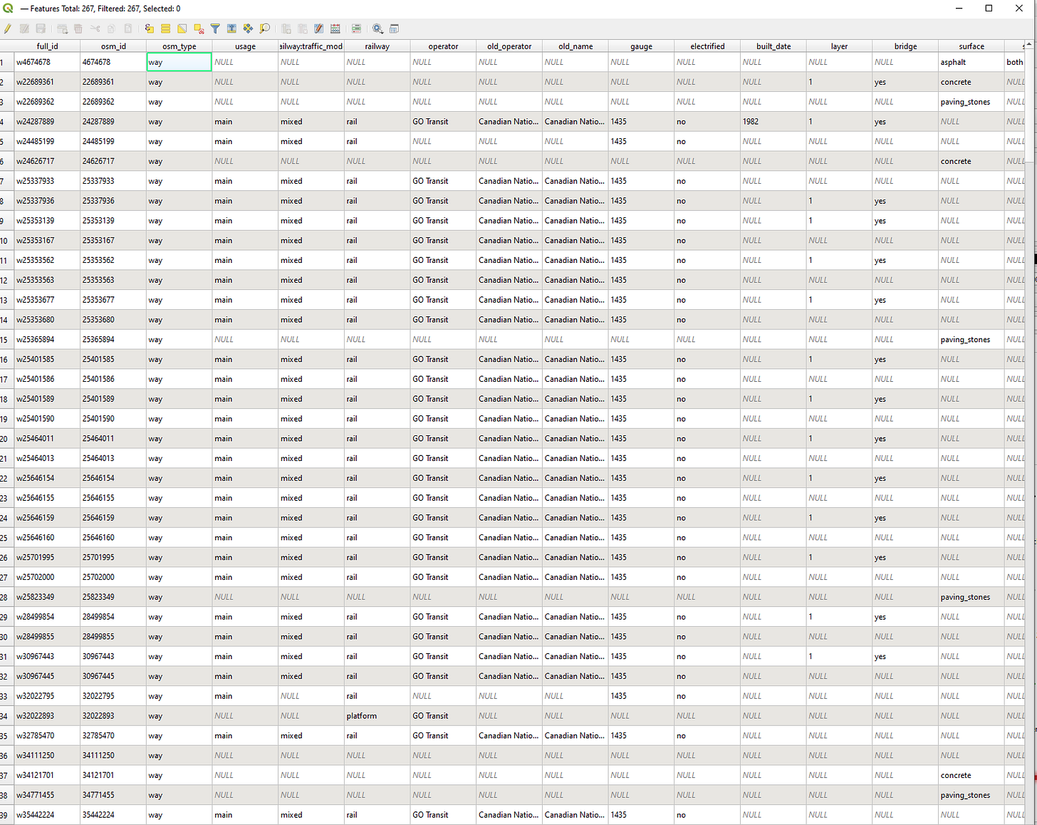
A vector map would have a GPS coordinate for every point in the map, along with various database information like type classification, web links, altitude, the material it’s made of etc. Here’s the same area in Vector data:
A printout of all the database information for this part of the vector map would take up about 1,000 pages. This makes vector maps 100s of gigabytes and often cost thousands of dollars.
However, you can do some amazing things with vector maps. You can do simple things like make the railway tracks into cat footprints and the baby change tables into big red stars
You can also do more complicated things like generate a list of condo units you can see into from the top of the CN tower, then filter them for which ones:
Have concrete construction; and
Have brown exterior walls; and
Are within 500m of a gravel footpath that terminates at a subway station.
Creepy eh? And this is all available online through freeware and open source databases maintained by some very dedicated and nerdy enthusiasts.
In my case you can tell the map to display all the relevant terrain features using the FLOCARK typology that I’d previously been manually entering as shapes into PowerPoint. For this clip it’s a bit boring as it’s black lines for roads, black blocks for buildings and black lines with cross lines for railways:
But if you zoom out from 1:650 to 1:350,000 you have a usable FLOCARK map. Feel free to use this to plan your invasion of the Greater Toronto Area:
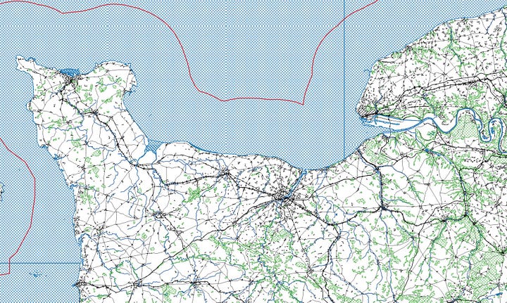
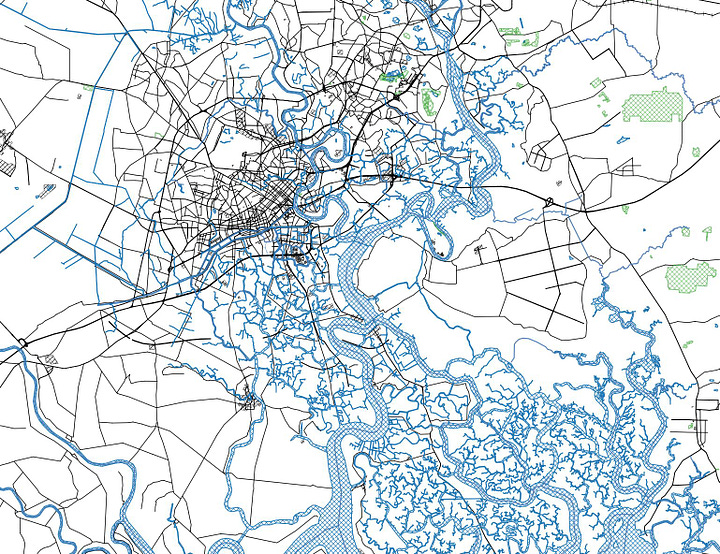
This has given my a very excellent tool where I can create maps visualizing just about anything. Do you want FLOCARK maps of Normandy, Ho Chi Min City (formerly Saigon), a map showing only the world’s ports and airports, all the Brothels in Germans (what the hell Dusseldorf?)


In any case, this is how I developed the automated maps that show up in my later episodes. For example, here’s the map of Kyiv:
Downloadable Ukraine High Res FLOCARK Map
As a thank you for reaching 1,000 subscribers to my YouTube channel I’ve created a high resolution downloadable map. It’s about 8mb and if printed out would be about 6 x 4.5 feet at 450 dpi. Here’s the low resolution version:
And here’s the link to the downloadable high res pdf link.
Feel free to use the map for your own analysis. If you use it on social media or another online platform please just attribute it and include a link to my YouTube Channel.
Thanks once again to all the people who did so much to promote my channel. In particular (and in no particular order) BlackHorse, Semiogogue, Charlemagne and Diana of A.


Why did YouTube delete your account? I didn’t see anything objectionable, now I want to know what I missed. My brother taught me how to make FLOCARK maps using a sharpee and cellophane. We made one of our rural mountainous area where we grew up and played army shooting at each other with Daisy pump BB guns luckily nobody lost an eye.